Breakfast etc.
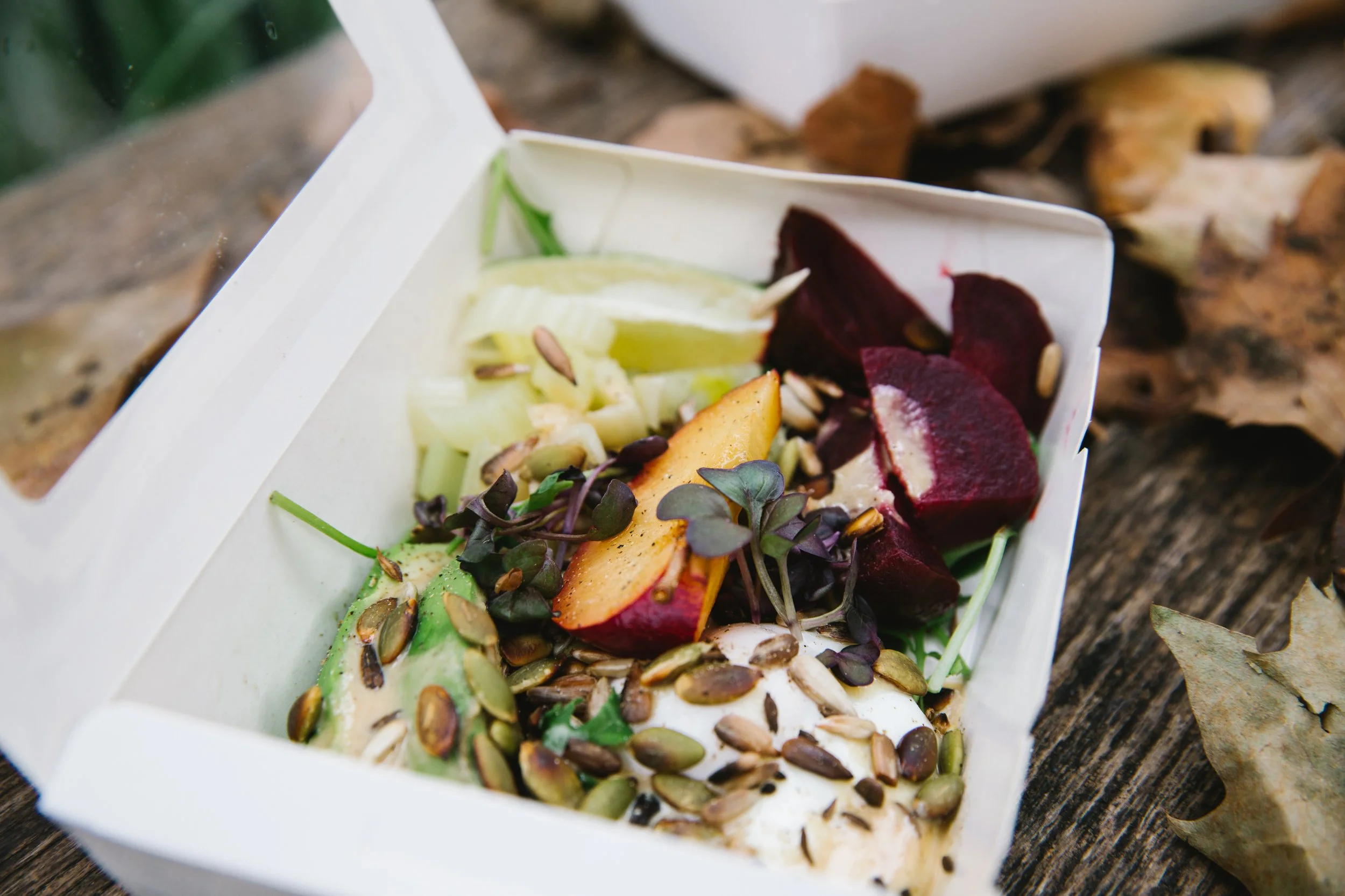
Being passionate about brands and healthy living, I created my own brand - Breakfast etc. The idea was to create a breakfast box that customers can pre-order and pick up from their local cafe in London.
The concept for the brand was nonchalance which represented what the natural food was about: imperfect, alive and playful. It was then contrasted with a more serious environment that represented the target audience of working professionals.

Brand identity, from logo to packaging, reflects minimalism, imperfection and aliveness - the very essence of natural food. This was achieved through the selection of the font that looks quite classical and serious but also playful in its slight misalignments.
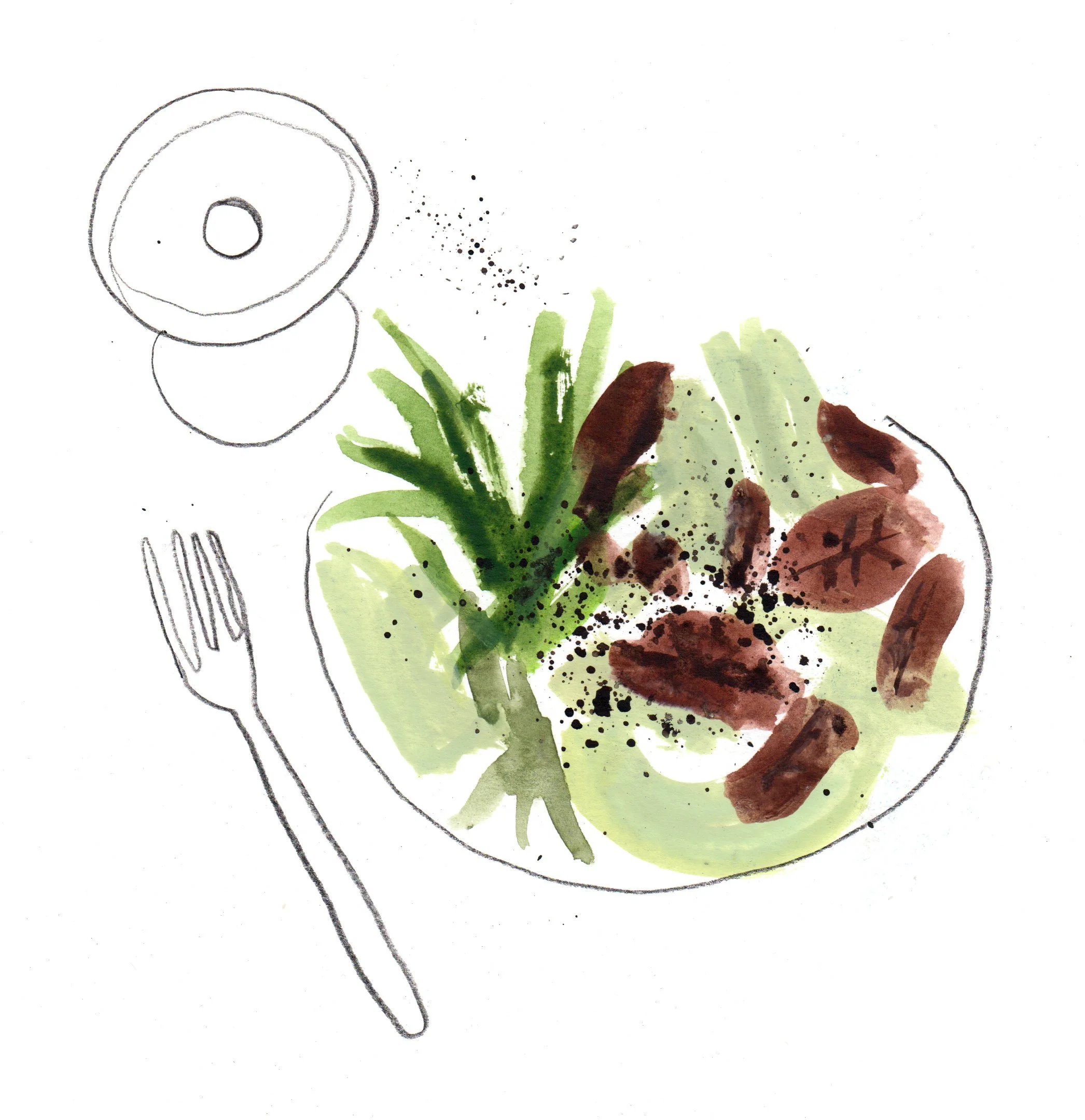
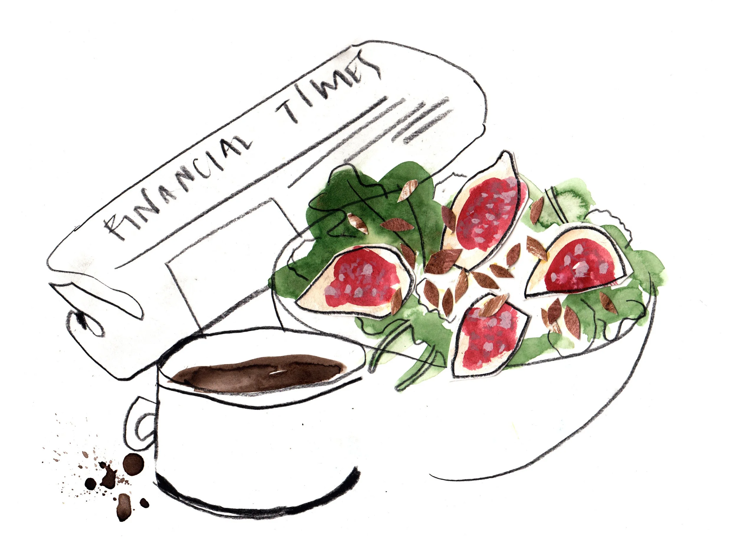
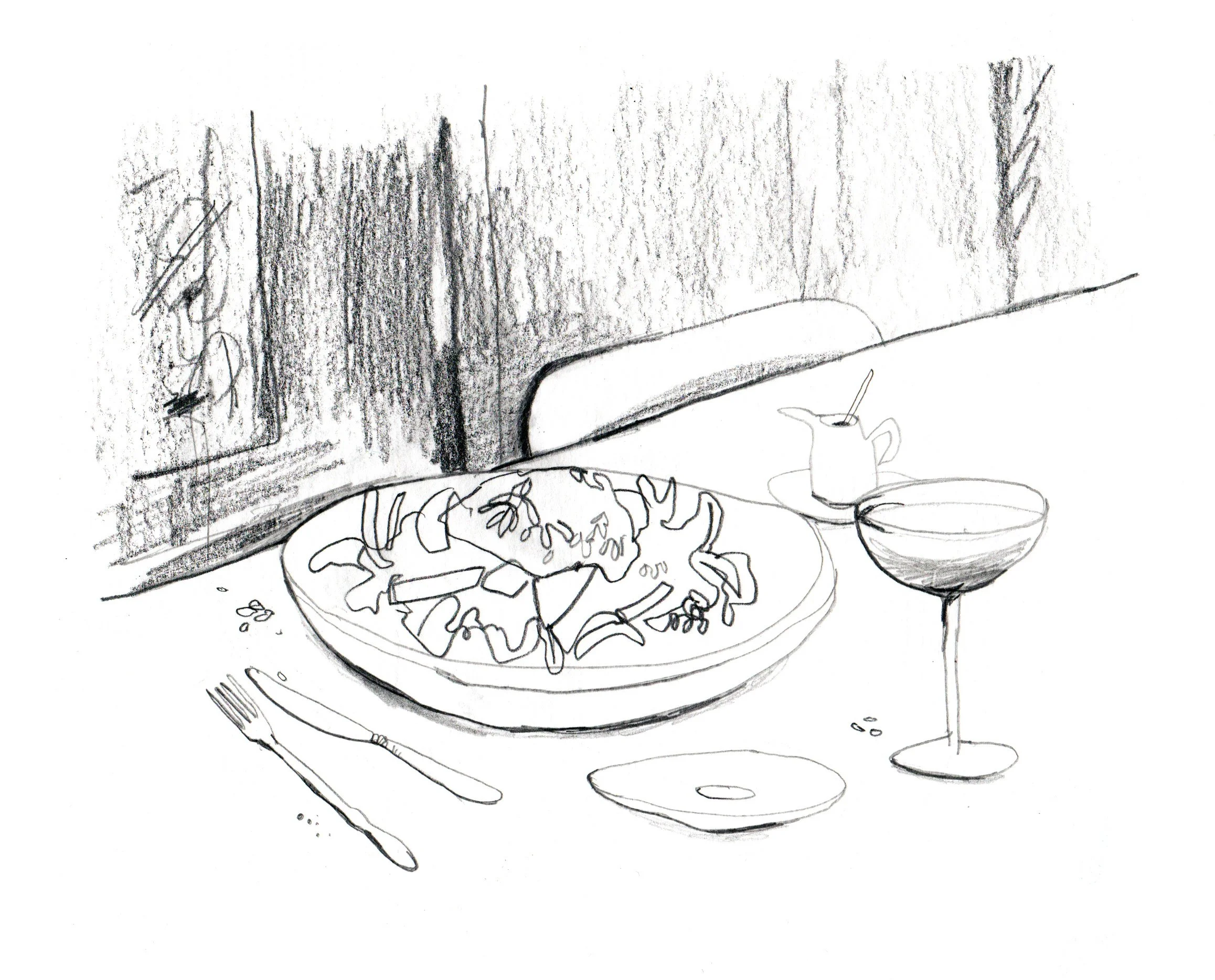
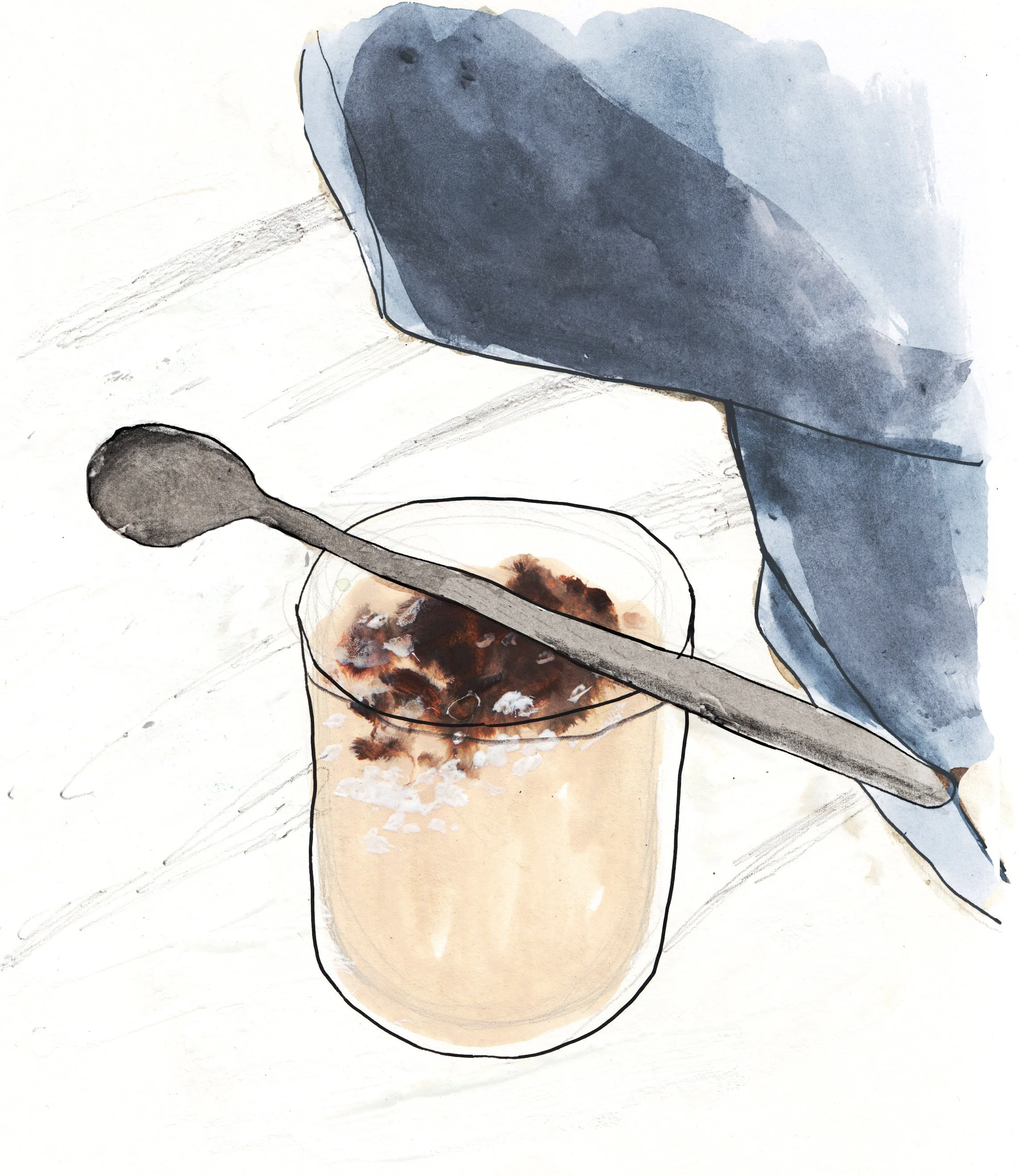
Illustrator Ciara Quilty-Harper was commissioned to create artworks for the brand that were later circulated on social media and used for POS communications. We wanted to keep the feel of nonchalance, lightness and fun, while balancing it out with a more serious everyday context.
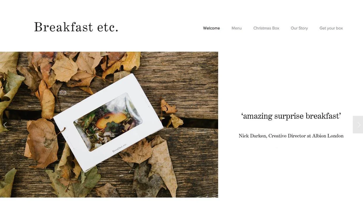
The website where customers could order their breakfast box.
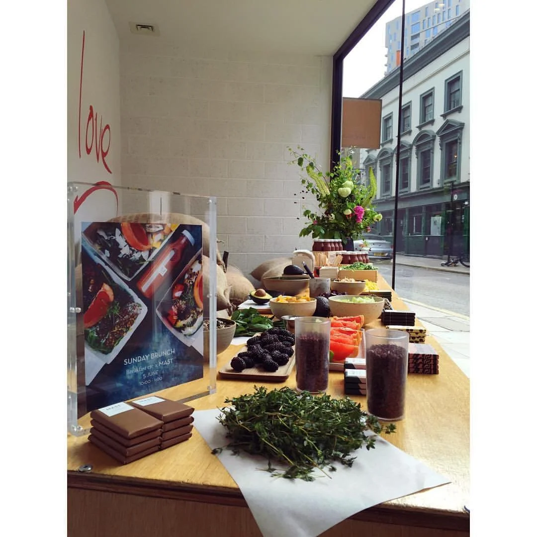
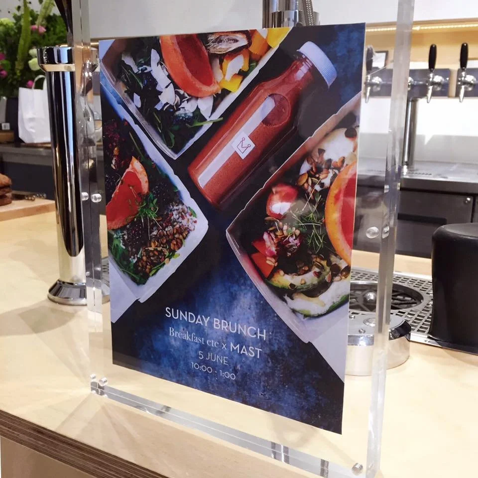
Collaborations with adjacent brands (Mast Brothers, Anthropologie London, Crooked Nose & Coffee Stories, Calvert Gallery etc.) to organise pop breakfast events and spread the word of mouth about Breakfast etc.
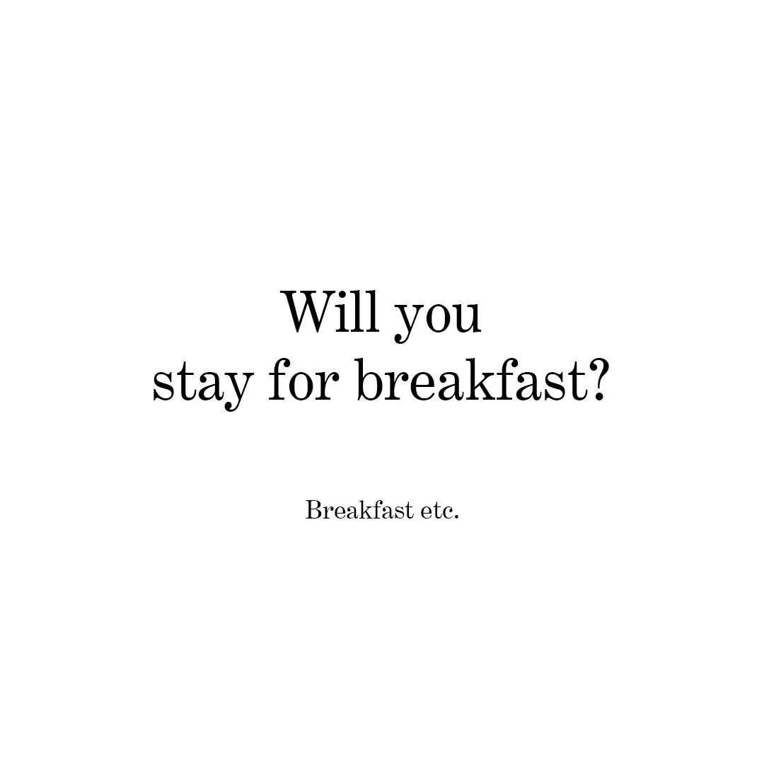
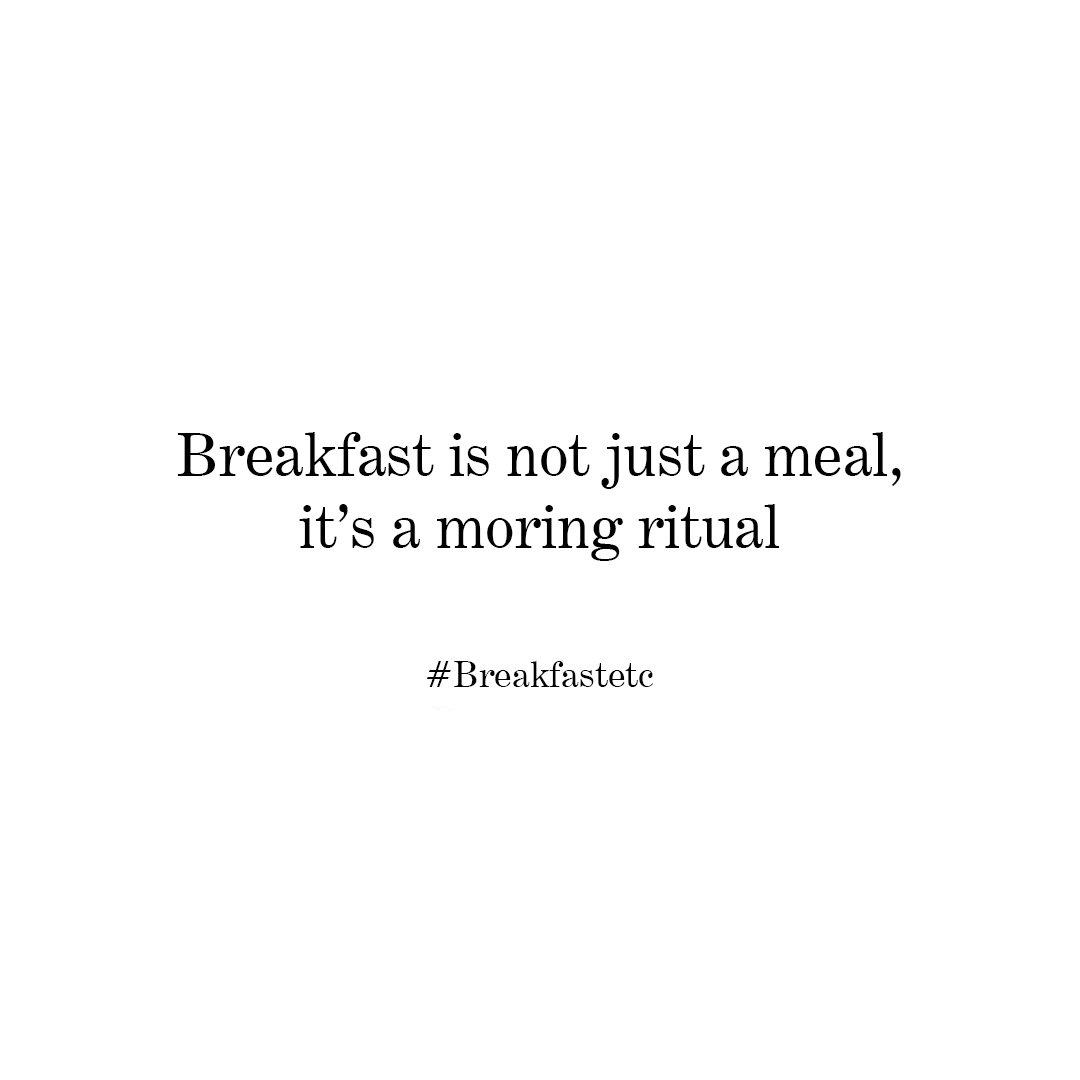
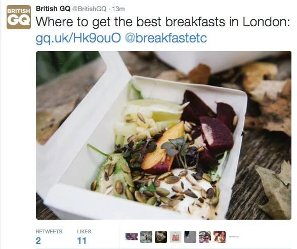
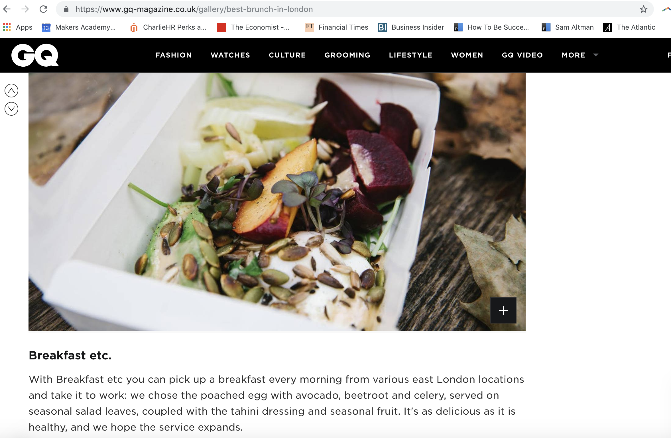
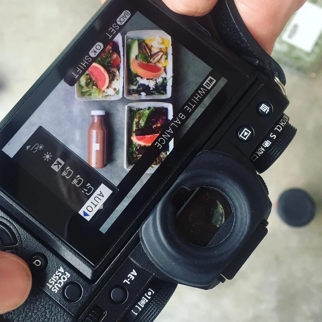
Some of the social media posts to invoke customer interest.